Monday, October 24, 2011

Doodling in Office

Like many others I have spent way too much time in boring meetings and my pencil – instead of taking notes –  “pursued artistic license”. imageMaybe that is the reason for the neat “artistic effects” provided in Microsoft Office 2010 products like Word, Excel, and PowerPoint.
Several of these effects transform a photo or other inserted picture, into renderings that look as if they were done in pencil, pastel, or chalk. These media and one other effect, “Photo copy”, are the topic of this article.

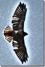
Let me use one of my hawk pictures to illustrate some of the effects.
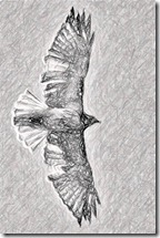
LJK_3288-v-Pastel-72LJK_3288-v-P-11LJK_3288-v-LD-0LJK_3288-v-PSk-100
Here, in order from left to right, is a “Pastels Smooth”, “Pencil Grayscale”, “Line Drawing”, and “Pencil Sketch”. The effects can be adjusted, for example in pencil size in the “Pencil Grayscale” effect can be set from “0” to “100”. The four examples in the composite here were made with settings of 1, 11, 20, and 100 from left to right.
image
Other effects are similarly adjustable. As you would expect, some settings are more appealing than others depending on the original picture.
All of the effects offer “transparency”.  The transparency setting allows more or less of the original picture to show through. The illustrations above were all made with the setting at zero.Letting some of the original show works better for some effects than others.
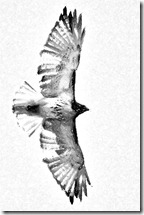
I particularly like the “Photo copy” effect with some transparency. This effect emulates photo copies of days gone by when copies of photos showed just strong outlines in black or white. Here is the original photo, a couple of “photo copies” with no transparency and “detail” of 2 and 6, and the last one at detail set to 10 (the maximum setting) and transparency at 60 (percent).
Red-tailed HawkLJK_3288-v-Phcopy-2-00LJK_3288-v-Phcopy-6-00LJK_3288-v-Phcopy-10-60
Another effect is “Chalk Sketch”. I am showing here the effect with the Pressure” set at 3 (the range is 0 to 4) and transparencies of  0, 30, 50, and 70.
LJK_3288-v-Chalk-3-00LJK_3288-v-Chalk-3-30LJK_3288-v-Chalk-3-50LJK_3288-v-Chalk-3-70
You can see how this wide range of possibilities can help you get an illustration just right for what you would like to do.
Some of the other “artistic effects” available in the Office programs are discussed in other posts in this small series:
  • Painting with Word – the “Paint Brush”, “Marker”, and “ Watercolor Sponge” effects.
  • Excel in Art – the effects called “Cement”, “Glass”, “Glow Edges”, and “Cutout”.
  • Image Trickery – effects “Light Screen”, “Mosaic Bubbles”, “Plastic Wrap”, “Texturizer”, and combining of effects.
.:.
© 2011 Ludwig Keck

Friday, October 7, 2011

Painting with Word

Poets paint glorious pictures with words. Here, however, I am talking about painting with Microsoft Office Word 2010. Word, and other Office apps, Excel, PowerPoint, offer over twenty “Artistic Effects” for manipulating pictures. I have had a lot of fun recently transforming a number of my photos in a variety of ways, see my “Café Art collection”, and used these effect on many of the images.
Here I wish to share some of the way these tools work as seen from an engineering or teaching perspective rather than an artist’s view. Specifically in this article I will discuss just three of the effects: “Marker”, “Paint Brush”, and “Watercolor Sponge”. Other effects I will discuss in other posts.
All of the effects permit a range of options such as “brush size”, and the effect also varies with the resolution of the picture.

Paint Brush

As the name implies, “Paint Brush” simulates the effect of a brush painted picture. For some images this can be a very pleasant and effective treatment. Here I am using a photo of a hawk in flight. AE-PaintBrush-4-1145px
This first image, using a brush size of 4 on a medium resolution (1145 pixel wide) photo provides the “painted” feel that I like best. Larger brush sizes cause too much detail to be lost in this image, smaller ones do not provide enough of the painted look. Here are a couple of extremes:
AE-PaintBrush-2-1145px
AE-PaintBrush-10-400px
The left image used brush size 2 on the 1145 pixel photo, the right one brush size 10 on a 400 pixel photo.

Marker

AE-Marker-97-1100pxMarker is an unusual effect tool. The size of the marker “dab” is not adjustable, but the density is. This is illustrated in the two images here. The first one uses a “size” of 97, the second of 20. You can see that the “20” image has just a few dabs, while the “97” looks more like a marker dabbed painting.
AE-Marker-20-1100pxWith this effect I did not notice much difference in the appearance when using low or high resolution images.
Clearly the lower size does not look like a painting. It looks like a photo with smudges.
Since the brush size is not adjustable this effect will work well with images that have large graphic forms, less so with photos that have a lot of detail.

Watercolor Sponge

For this last effect I will again use a flower picture. Here is a matrix of results. The top row image has a resolution of 600 pixels, middle row is 1200 pixels, and the bottom row 2400 pixels. The left images use a “Watercolor Sponge” of size 1, the middle use size 5, and the right images use a size 10.
AE-WatercolorSponge-01-600
AE-WatercolorSponge-05-600
AE-WatercolorSponge-10-600
AE-WatercolorSponge-01-1200
AE-WatercolorSponge-05-1200
AE-WatercolorSponge-10-1200
AE-WatercolorSponge-01-2400
AE-WatercolorSponge-05-1200
AE-WatercolorSponge-10-2400
The artistic effects provided by Word 2010 may not have as wide a flexibility as one might like, but they allow sufficient manipulation to achieve some interesting results. As you can see from the illustrations here, the resolution of the starting photo determines the how the effect will appear.

Technical Details

If you are not familiar with the Picture Tools in the Office 2010 applications here is a very quick overview of how to get to them.
image
Insert a photo from the Insert tab (IllustrationPicture). The inserted photo will be selected. Click on an image to select it. The Picture Tools tab is only shown when an image is selected. The Artistic Effects are in the Adjust group as shown in the illustration here. The adjustment options are brought up with the bottom item “Artistic Effects Options …”. As you can see here, the selection is made using thumbnails showing the effects on the selected image.
Some of the other effects are discussed in other posts on this topic:
  • Doodling in Office   – pencil and drawing effects.
  • Excel in Art – effects “Cement”, “Glass”, “Glow Edges”, and “Cutout”.
  • Image Trickery  – effects “Light Screen”, “Mosaic Bubbles”, “Plastic Wrap”, Texturizer”, and effect combinations.
.:.
© 2011 Ludwig Keck

Tuesday, September 27, 2011

Blogger offers new designs, improved performance

Blogger took a major step today with a rebuild and modernization using the latest web technologies, HTML5 and CSS3. If your blog is hosted on Blogger be sure to check out what is new. You just may want to restyle the looks of your blog.

image

There are seven new designs with plenty of ways to customize the look and feel.

You owe it to yourself to explore the possibilities. Be sure to check out the backgrounds and other features.

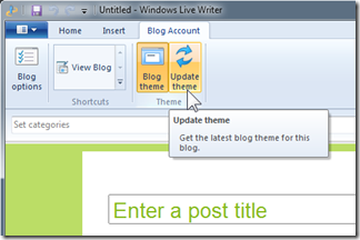
imageOnce you have decided on a new look and clicked “Apply to blog” on each option page, there is one more important step.

Open Windows Live Writer, click the Blog Account tab. Then click Update theme. Moments later you will see your Live Writer showing the new design, fonts, and sizes.

Here is how it looks for my Café Ludwig blog:

image

If you are reading this at Live Writer Basics click Café Ludwig to see this post over there – and vice versa.

Happy blogging!

.:.

© 2011 Ludwig Keck

Tuesday, September 6, 2011

Café Art

It has taken me way too long to come up with a name for my collection of playful transformations of photos. Much of my free time at Case was spent at the Cleveland Museum of Art across the street from the school, so calling these images “art” seemed totally sacrilegious. The term “café art” for images that I would be willing to see hanging on a wall is, I hope, acceptable.
The collection is newly “curated” – as I dig out older ones I will add them, and there will be new ones from time to time. Enjoy!
.:.
© 2011 Ludwig Keck

Friday, September 2, 2011

New photos from Stephen Blecher

Stephen Blecher added photos to his “Visiting Artists” gallery at Café Ludwig. Here is one of the new ones:

Click on the image to view the Visiting Artists Gallery page.

.:.

Monday, August 15, 2011

When the photo isn’t good enough: create art

Well, art is in the eye of the beholder. This wouldn’t be the first time that I have been turned away at an art show.
But here, for your viewing pleasure, my little moth: As it was on the wall.
LJK-3116-800
And here, many hours later, as “Moth Balls”:

.:.

Friday, August 12, 2011

Background to the rescue?

Have you ever tried to figure out what great photos have in common? moth6
Sorry, but I don’t have a representative collection to share here and let you decide. So you will have to put up with my ideas, at least until there is sufficient feedback to this post to set me straight.
moth4In looking through several albums of photos that are considered good either by their creators or others, it was easy for me to see that great photos are strongly oriented on their subject, have no extraneous details, that there is a strong visual design, snappy, often exaggerated, colors, and a simple but supportive moth8background. The background sets off but supports the subject.
I came across a rather “blah” photo when looking through my most recent “catch” and I said to myself, this might work on a different background.
moth2No sooner said than done.
And here, dear reader, is where you come in. Alongside is the photo on different solid backgrounds. The original is included, it should not take you but a few seconds to identify it.
moth7Which, in your opinion, works best?
Why do you think so?
Would you hang any of these on a wall in your room?
Do any of the solid backgrounds improve the photo?
moth9Can you think of some other background that would work better?
And lastly, but maybe most importantly, can a different background really make a difference?
Please let me know your thoughts, either with a comment on this post or any other means of communicating. I would love to hear from you.
.:.
© 2011 Ludwig Keck