"A rose by any other name would smell as sweet", so said Shakespeare, but would a rose in another color look as pretty?
I had a bit of time on my hands the other day and was rummaging through my archive. I came across the original raw image of one of my “famous” images and thought, why not give it another interpretation? Then I discovered that I had taken two photos of that rose. The other exposure had not even been converted from the raw image file. Totally ignored for six years.
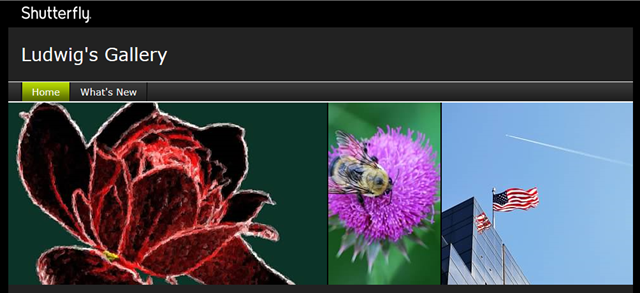
The photos were nothing special, just pictures of a rose in the Botanical Garden of Georgia, photographed way back in May of 2008. But I had used a “café art” interpretation on my Shutterfly gallery cover of one of them. With a lot of noise added it has also served as one of the download practice images for readers of my “Digital Pictures Basics” books. Thus the “fame”.
There were already a number of “interpretations” of this photo in my archive, unshared and unseen. The other exposure, taken from a slightly different angle, has a more disturbing background, thus its total neglect. I decided the classic rose shape deserved some more exposure. Several version were shared on my blogs and in social media, so here is the rest of the story.
First a cropped version of the “famous” one:
A nice enough photo of a rose. Certainly not an exhibition quality image. So it should not surprise that this picture has not been shared before.
Here it is as seen in “café art” dress on my Shutterfly gallery:
I had made a couple of versions in that style. The blue one is a bit gruesome.
The real “fame”, as I already said, comes form the version used to demonstrate “noise” in photos. With my Digital Pictures Basics books reader also get a link for downloading practice photos. The books explain how to make this into a better photo using Microsoft Photo Gallery. Here is a larger versions and a hopelessly noisy black and white version.
Another previously unpublished version just dropped out the background altogether. I rather like this version.
Now the “other” one
 The companion photo has the flowers in the background much closer to the rose. Both photos were taken as verticals. Here is a “café art” version of the previously unused exposure. The full frame as it came out of the camera is used here. As you can see the formatting and the background are less than successful.
I decided that just the classic outline of the blossom could serve as attractive images. In fact, when shared on social media, they were well received.
My favorite tool, especially for working with outlines of objects, is Topaz Simplify. This marvelous “painting” tool, or filter as some call these, has sliders for adjusting the line thickness and the feature sizes to be used, and actually a lot more. Here are four very simple rose “drawings” derived from this image.
So here you have a white rose, two red ones, and a yellow rose. Which looks better to you? Is a rose in another color more beautiful?
Lagniappe
You may have discovered this already. Each image above is a link to the same photo in an album on my OneDrive. You can go back and forth there to inspect them in more detail – even see them as a slide show.
.:.
© 2014 Ludwig Keck


A rose in any color is beautiful to me, Ludwig, but my vote would go for the white one, and then maybe yellow...and of course, au natural is wonderful as well.
ReplyDeleteThank you Beatrice, hope it brought a smile!
ReplyDeleteYounare welcome, Ludwig, as I am always happy to find a new post on your blog. One day we will make that southern road trip or you might make a northern one...and we will meet.
ReplyDeleteWe'll make sure we don't miss each other ;-)
DeleteI will concede that Mother Nature is a much, much better artists than I will ever be. Thank you Linda.
ReplyDelete