My last post showed two images and asked, "which do you think is the better one". Beatrice (see her comment) concluded, "there really wasn't enough here to grab my attention."
I had replied in part, "This is a difficult subject to photograph. There are a number of ways to guide the viewer to what the photographer wants to show. Usually first on that list are guiding lines, there are none in this scene. Another way is to emphasize with light. In the top photo a slight vignette attempts to do that. Frames are a good way to lead the eye. The subject here, the sculpture, is a frame and thus leads the eye away from itself. That plain tree in the background becomes the center of attention and it has not much to offer.
Let's review how to guide the viewer.
- Leading lines - none in this photo, so this dies not help.
- Vignette - slightly dimmed edges help bring the emphasis to the center. That is typically done in post-processing, although some camera lenses do this because of their design. The center here is not the subject, so this doesn't do much for this photo.
- Using a frame - that works, unfortunately, the subject is itself a frame and thus leads away from itself.
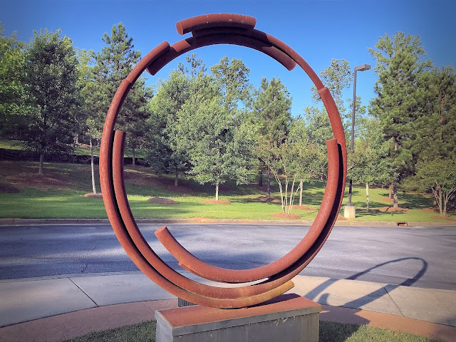
- Lighten the subject or darken the background. That is another way and I darkened the background in the first image below in post-processing. In a studio this is easy, outdoors not so much, waiting for a cloud to come by and shade just the background is an approach, but not for me and not in this situation.
- Blur the background - A standard technique used by photographers. Just open the lens wider. Not for this photo. I was using a smartphone and the aperture on those are fixed. Here already at f/1.8. But the vey short focal length, 4 mm, gives a wide depth of field. Blurring the background can also be done in post-processing and I have an example below.
Here are my reworked photos:
To darken the background I selected the sculpture so I could keep it lighter. As you can see, I did not do a very good job and it looks "artificial".
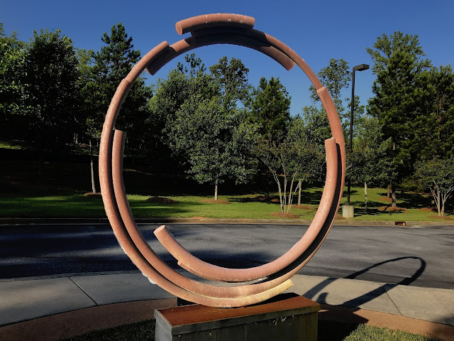
Again I selected the sculpture and made the selection a separate layer. Then I blurred the image "underneath".
The trouble with that approach is that the blurred layer also widens the sculpture and that shows in the image. A little bit of this is ok, but unless masking is carefully used, this also gives fake looking images.
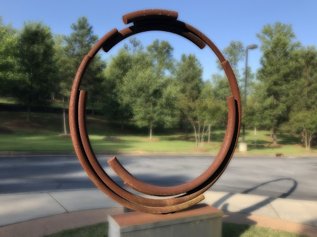
Hare is my version with a little bit of vignetting, background darkening and background blurring.
Now what do you think? It is still a tough subject to photograph. Maybe another day, with my big camera ...
.:. © 2023 Ludwig Keck


There is indeed yet another variable which you failed to explore. I would have backed off some and either used a longer lens or cropped the image. For me, both the tree at the left and the light pole on the right distract. By backing off you move both of these distraction away from the sculpture itself. You also make the single tree being framed by the sculpture a more dominant element of the composition. Try revisiting the scene and move around more....
ReplyDeleteThank you, Tom. You are right about the tree and the light pole. They bothered me from the moment I saw the photo. I considered cloning out the light pole and changing the color of the wrap on that tree. Might yet do it. Backing up is not a option. The sculpture is in front of a building, so I could back up just a few feet. It is a wide building and blocks the view severely. The building as a background did not appeal to me.
Delete