Thursday, December 2, 2010

Happy Holidays! Word 2010 as my Art Studio

HappyHolidays

Wishing you all the best for the Holiday season and the Coming Year!

This card has been in the works for well over a year. Last December I prepared decorations as I remember them from way back in Europe some seven decades ago: Home-made cookies and candy and real candles, of course. 2009-12-23 ChristmasTree-DS 018 - Copy

Then came the photo session. The shot I finally settled on was this: You can see some of my set and how the lights were set up. File conversion, touch-up and cropping was done in Windows Live Photo Gallery. For the final picture editing and manipulation, I used Microsoft Office Word 2010 and the marvelous Picture Tools it provides. The image was converted HappyHolidays-W2010using Artistic effectsCutout, set to 6 shades. I added three shapes – a black box to define the background, a gradient for the glow around the candle and a four-point star for the light spikes. It is nice how images can be stacked with specific colors picked as the transparent layer. Cropping and the greeting text, with Text effects applied, finished it to my satisfaction. 

Sure, I have image editing programs that can do all that, and better. But I enjoyed using the simple tools in Word, Windows Live Photo Gallery, and Paint, to create just what I wanted to share with you. We all enjoy making and receiving home-made gifts. This one I made for you!


Wednesday, November 17, 2010

Noise reduction in photos

In another post I showed how to lighten shadow detail in photos with strong lighting contrasts (Coping with harsh sunlight). The price one pays for lightening dark areas is making noise much more noticeable. Although there is no free lunch, it is possible to reduce the price. “Noise Reduction” to the rescue.

Here is an example photo, one that was taken in direct sunlight, with deep shadows in the subjects face. The strip shows a section of the original with the same section from heavily post-processed versions.

The left-most image is a crop from the original – clearly too dark to even recognize the child. Processing was done using Windows Live Photo Gallery 2011. In the second image the Adjust ExposureShadows slider was set full right, the edit mode closed to save the file and the process repeated. This just about eliminated the shadows. You can see the effect better by clicking on the image strip for a larger view. Noise became very prominent in the areas that had been dark.

Next I aggressively reduced noise, see third image. You can see that the image histogramis “smoother” but has some ugly artifacts. In the “lighten shadows” operation the dark area was lightened by a factor of about six. See the histogram of a small area (original on top). The noise was also increased by this factor and was too high to be effectively eliminated by the noise reduction step.

How about doing the noise reduction first then the lighten shadows operation? The result is shown in the fourth image. Smoother, but notice how small detail (hair in front of hat) has been blurred.

The fifth, right-most, image was produced by reducing noise, but less aggressively, then lightening the shadows, followed by another noise reduction step. This last procedure produced the most acceptable result.

Still no free lunch, but using all the editing tools available in Photo Gallery can go a long way to getting results you can share with pride.

Please also visit my blog on computer tips: This ‘n That


Saturday, October 23, 2010

Coping with harsh sunlight

Since time immemorial photographers have been admonished to avoid the noonday sun. Yet morning and evening sunlight, though nicer in direction andLJK_1744-DEMO3-A3 (640x640) color, can also produce inky-black shadows in pictures, that make them almost worthless.

There are ways around this dilemma.

SunPick a setting where lots of light is reflected into the shadows. Think white-washed walls on Greek islands, sugar-white sand on Gulf coast beaches, fresh-fallen snow. Maybe those are not always practical.

SunUse one or more reflectors to lighten up the shade. I like white umbrellas, they are more compact than most professional equipment and lot less expensive. Watch the umbrella display on your next visit to the drug store.

SunTurn on the flash on the camera for fill-in light. Most digital cameras even have a setting for this.

Light bulbIf none of the above are workable solution for a situation, there is post-processing! You guessed the reason I chose a fast-moving kid in bright evening sunlight with the surroundings in deep shade, so the shadows would be dark!

Getting the shadows lighter is easy. Here views of Picasa and Windows Live Photo Gallery in action. Note the red pointers.

fix-shadows

In Picasa (on the left) the control is called “Fill Light” – the default setting is with the slider at the left. Moving the slider right lightens the shadows and you can see immediately the effect. In Photo Gallery the control is under “Adjust exposure” and is called “Shadows” (click Fine tune to get to the controls). This control goes both ways, to the left to darken shadows, to the right to lighten them.

Ah, but even here at Café Ludwig there is no free lunch. There is a price to pay when doing this. Let’s take a look at exactly what happens when you “lighten the shadows”. The image consists of individual pixels, each with its own level (really in each color – red, green, and blue). The lower level pixels are changed – amplified – to a higher level. The lowest level pixels, nearly black, are also at the lowest electrical level. There is always some electrical noise in processing signals, the lowest pixels are affected the most.

If the noise is just one bit up or down, that is 1 in 256 for normal 8-bit JPG images, then the bits at level 1 maybe recoded as o, 1, or 2 – a huge percentage. The noise problem gets less for higher pixel values. A pixel at level 10 with this noise would be 9, 10, or 11. Just a ten percent change. LJK_1751-DEMO3-A2

When these pixels are increased in value, so is the noise. Double that level 10 pixel, and the noise is now twice as large. Here is a close-up section of a photo showing the face our athlete. The left side was in deep shadow, the right in full sun. Bringing up the low-end pixels to “lighten the shadows” also brought up the noise. You can readily see that in the illustration.

So there are limits to post-processing “fill light”. Is there help for this? Of course, why else would I ask the question?

When using Windows Live Photo Gallery, Picasa, and other common application the photos are processed in 8-bit JPG format. That means there are 2-to-the-8th, or 256 levels. Most cameras can do better than that, “raw” format is usually 12 or 14 bits deep. That means there are many more levels before the noise is reached. Astonishing improvements can be achieved when using dedicated image-editing applications like Photoshop, Paint Shop Pro, or others of this type, that can take full advantage of what the camera delivered.

For me, well, I will keep my white umbrella handy.


Friday, September 17, 2010

Goodbye Kodachrome

It has been many years since my last roll of Kodachrome. Like most of the rest of the world, I “went digital” a long time ago. So the time for Kodachrome has passed and it is departing into its rightful place in history. 

I started using Kodachrome as a college student more than half a century ago. Kodachrome was not just a color film, one of many tools for my photography passion, to me, and many others, Kodachrome was a potent teacher.

With Kodachrome the exposure had to be spot on. The slightest bit of over-exposure and the highlights became a chalky mess, a bit of under-exposure and the shadows became inky black. You learned to us your exposure meter. Reading the grey card, the bright areas, the dark parts – it was a bit of a production to take pictures with Kodachrome. You could not see the results for a couple of weeks while the film was at the lab. If you did not get it right, that exercise was a learning experience and history.
K01-frame

Since Kodachrome yielded slides, mounted slides, there was nothing you could to about the framing after the shutter was released. So you learned to see the final picture, all of it. Viewfinders had sophisticated parallax correction to help the photographer get it right. You physically moved in and out or - more rarely - changed to another lens. Zoom lenses were still a distant dream.

When I first started using Kodachrome, the daylight film had a speed – sensitivity rating – of ASA 12 (that measure, “American Standards Association” has now give way to ISO numbers of equivalent value). That slow speed required very careful management of the camera settings. If you wanted any measure of depth of field and wanted to use the aperture at f/11 that K02-framemeant 1/30 second for daylight scenes. Long shutter speeds demand very careful shooting. Kodachrome taught to spread your feet, to press the elbows into your sides, and how to breathe.  For action photos like sports, to use short exposure times, like 1/500 second, meant shooting with the aperture wide open. This yields a shallow depth of field and demands perfect focus.
Yes, to use Kodachrome successfully meant knowing your camera, your subject, and applying that knowledge with care.

There was for me another very important lesson. Kodachrome was expensive, more expensive that other color films. As a poor college student I had to be very frugal. That meant making K03-frameevery exposure count.  It also meant that you had to press the release at just the right moment. Cartier-Bresson made Cardinal de Retz’ “decisive moment” his trademark and book title.


Today there is nothing to teach these lessons to aspiring photographers. Technology in modern cameras takes care of all these matters. Exposure is evaluated by hundreds of sensors and the computer determines the appropriate settings. If it still is not completely right post-processing can make the corrections.

Today zoom lenses are ubiquitous. Getting the framing right is just a twist of a control. Cropping in post-processing is standard operating procedure.

Holding the camera steady has long ago been made obsolete by image stabilization.

The primary controls on modern cameras are not shutter speed and aperture – no, you select “scene mode”, like: Portrait, Landscape, Close-up, Sports, Night Portrait, Night Landscape, Party / Indoor, Beach / Snow, Child, Sunset Dusk / Dawn, Pet Portrait, Candlelight, Blossom, Autumn Colors, Food, Silhouette, High Key, Low Key (these from the just introduced Nikon D7000). The computer inside then judges the correct settings. No worry about depth of field or a blurred subject because it moved too fast.

“The decisive moment” – history – today some cameras capture images even before the shutter is pressed. Just select the best one.

Us old-timers can only shake our heads and wonder about todays youth. How will they ever learn? We had it easy: When you mastered Kodachrome, you mastered photography.

So a fond goodbye to Kodachrome, that stern taskmaster, and brilliant teacher.


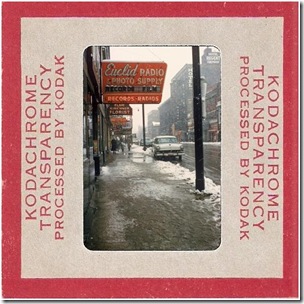
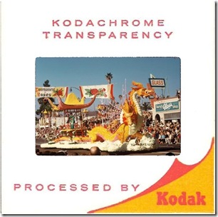
P.S. The illustrations here are faked: The photos were flipped in post-processing for esthetic reasons, modern technology rolls on. Click on any one to take you to a slide show of old Kodachrome photos of mine – nothing special – all from my learning days.

Please also visit my blog on computer tips: This ‘n That

Sunday, September 5, 2010

Sunscreen for my Camera

On a bright, sunny day the sun can heat up dark objects in no time at all. My camera is black, carried on a neck strap, it becomes uncomfortably hot to the touch.  That kind of temperature cannot be good for the insides of the camera either. My solution is to dress the camera in white. Take a look at the picture.

Well-dressed-camera

A child’s t-shirt is just the perfect way to protect the camera from the unrelenting sun. My quick-connect neck strap goes through the sleeves. The t-shirt can stay in place to take a picture, with the bottom of the shirt pushed up over the lens, the viewfinder is accessible through the top of the shirt.

For better control of the camera, the t-shirt can be easily slipped up on the straps, it then stays out of the way amazingly well.

I have not drawn any unusual attention from any passersby, but I did have quite an experience acquiring the t-shirt. As an older person walking into a baby goods store immediately got me marked by the sales Well-dressed-cameraclerks as someone shopping for a grand child. Grand parents have a reputation of sparing no expense when it comes to buying a present for a grand child. So I was shown all kinds of fancy little shirts in all colors of the rainbow – except, of course, white. There was gorgeous lace trim, beautiful embroidery, thematic designs from baseballs to spacecraft. No plain white. When the clerk finally asked “are shopping for a boy or a girl?” my reply “neither, I want a t-shirt for my camera” really got me strange looks. I wasn’t sure whether they were trying to decide between calling security or for an ambulance. Trust me, delegate the shopping of a baby-size t-shirt to a young mother!

My camera stays cool, even if this is not the coolest in fashion statements. Should you see me with my well-dressed camera in a park or town, just give me a wave!

Please also visit my blog on “things computerese”: This ‘n That

Thursday, August 26, 2010

Musings on Zoom

It is nigh on impossible to buy a camera that does not have a zoom lens. Inexpensive cameras that do not sport the expensive optics still have, and advertise, “digital zoom”. Why is zoom so popular? My feeling is that it has to do with human vision. We see the world with a very wide field of view, nearly 180 degrees wide, yet the primary area of interest can be very small. Indeed when watching television the TV screen takes up typically less that one percent, less than one hundredth, of our field of vision.

Photos do not really reproduce the scene as we saw it and might remember it. We cannot visually zoom into the picture the way we could the actual scene. ButterflyWe have learned that maybe it takes several pictures, a wider view and a closer look. Even then we can be let astray. Here is a pleasant picture.

I saw a butterfly and took the picture. Right away I realized the picture I got was not what attracted my attention. This is really what I thought I saw:

Butterfly

Now this is just a crop of the first picture. Had I performed the operation in the camera it would be called “digital zoom”. It works here because of the limited resolution of pictures on computer monitors. There are cameras sold with 8 megapixel sensors and “8x digital zoom”. Pity the poor buyer who falls for that – pictures with the resolution of a large postage stamp at maximum zoom. But I digress.

So the zoom lens gives us the ability to capture the detail that we so easily discern in real life. But it takes several pictures.

There is a technology that lets us see pictures with a wide view and yet discern small detail. Not quite as easy as just glancing at a spot – you need to use the mouse, but still quite amazing. I am talking about Microsoft Zoom.It.

Here is a picture with a wide field of view – almost as wide as the human eye sees – over 100 degrees horizontally – and you can zoom in to see detail anywhere in the scene. This picture has over 25 megapixels.

For best viewing, maximize your browser and click on the image to see the image full screen. Use you mouse wheel to zoom and drag picture as desired.


Monday, August 23, 2010

Dud to Showpiece–Artistic Effects as the Hero

We all have some photos that should have been discarded in the camera but somehow seem to have some merit – maybe form, or color, or patterns – that appeal in spite of major flaws. Let me show you what I am talking about.

LJK_1124 (2) (320x214)

image

Here is a pleasant photo of a jelly fish. Unfortunately, the jelly moved and I moved the camera. The small close-up shows the flaws. This just is not “gallery” quality. I liked the photo, however. Maybe it could be used as a graphic in a brochure or greeting card …

Word 2010 to the rescue! image

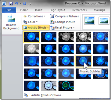
Word 2010 has a variety of artistic effects that can hide the flaws and still result in a pleasing illustration. “Artistic Effects” shows tiny thumbnails of the actual picture with the effects applied. When the pointer is moved to the effect it is applied to the actual picture so it can be previewed. For this photo “Mosaic Bubbles” seemed like the most appropriate effect. I selected “Artistic Effects Options” and adjusted the Mosaic Bubbles setting to a “Pressure” of 100. This reduced the space between bubbles and made for a cleaner look. So here is the final result, but there is more to getting there.

Click the picture for a large view.

Word 2010, as well as the other application in Office 2010, has some peculiar and unexpected ways of handling pictures and artistic effects. It allows only one effect – if you choose another, it restores the original picture that was inserted and applies the effect to it. Also, it changes the size of the image when saving theW2010-sa1 file. So do your work in one session and don’t save. How do you get the picture with the effect applied? Right-click on the picture and select “Save as Picture”. You can specify the file type – for most uses you will want JPG as the format. All metadata will have been stripped from the picture.

If it seems desirable to apply more than one effect, then the procedure is this:

  • Insert the picture
  • Apply the first effect
  • Save the modified picture – right-click – Save as…
  • Insert the modified picture back into Word
  • Apply the next effect.
  • Repeat as desired.

Let me demonstrate this with another photo. This picture has a rather dark LJK_1091-320background, the fish does not stand out very well – the edges, the tail – disappear into the background. So first I lightened the photo a bit in Windows Live Photo Gallery. Then inserted it into a blank Word 2010 document.

Background Remover

Word has a marvelous background remover tool. Here is the first default view using the tool. I set the cropping so all of the fish is included. Then I used the “Mark Area to Keep” and the “Mark Area to Remove” tools to draw lines into the tail to keep and small areas between tail and fins to remove. This is really quick, fewer then ten short strokes, you can see the “+” and “-” marks in the second illustration. Clicking “Keep Changes” removes the background.

Fish-W01

Fish-W02

I saved the picture as described already. In Paint I set a large area and colored it teal and then did a “Paste from” and inserted the fish picture. Back to Word for more artistic effects. First I applied “Plastic Wrap” to give the picture a ceramic tile look. Another save and re-insert to Word. This time for an overall texture effect.

Effects in Word 2010 scale differently with different picture sizes. I could not get a course enough texture for the original size. After resizing the picture the texture (at maximum setting) was to my liking. Here a couple of progress illustrations and the final result.

Fish-W03 (320x229)

fish-W-05 (320x213)

Click on the larger image for a full size view. I am happy with this fish. It is much more impressive than the original photo, don’t you think?

Maybe even good enough to hang in the café!

Thursday, August 19, 2010

Visit our Gallery

For a most relaxing and enjoyable break get a fresh cup of coffee and visit the Gallery page. Each of the images on the page leads to a gallery by that artist. The galleries are very likely to be different each time you visit as the artists change and add to the galleries. Visit often!
Enjoy!

Saturday, August 14, 2010

Art Effects from Photos - using Excel 2010

A photo outing usually results in a large number of images with just a few that are worth sharing. My trip to the Georgia Aquarium was no exception. But there is one picture in particular that I seem to enjoy looking at again and again. The pose, patterns, colors, shapes, just seem to work for me. It appears to just cry out for presentation in different transformations.

So here, with apologies and all due respect to the ichthyologists out there ---

“My Variations on a Theme by Volitans Lionfish”


Most picture organizing programs, like Windows Live Photo Gallery or Picasa, provide tools for editing and improving photos. For more extensive manipulations full-featured image editors, like Adobe PhotoShop or Corel PaintShop Photo, offer a huge palette of tools. A surprising and unexpected source of artistic effect tools is Microsoft Office 2010.

Excel is not just for numbers anymore!

Not until after you insert a picture into a cell and click on it does Excel 2010 provide a “Picture Tools” tab (this is also true of Word 2010 and PowerPoint 2010). One of the commands in the Adjust section on the Ribbon is “Artistic Effects”.

It is an absolut pleasure to use. The menu shows little miniatures of the selected image with the various effects applied. Hover the mouse pointer on one of the miniatures and instantly the effect is applied to the picture so you can preview it. There are also options to adjust the effects such as brush size.

Other options allow you to soften or sharpen the image or to change brightness and contrast – with the Corrections tool – or to change the coloring with the Color command.

The Color menu allows control of color saturation and “color tone” – color temperature. It also has a palette of intriguing “recolor” options. These recolor options include some interesting black-and-white choices as well as effects for changing the overall picture coloring. You can see the miniatures here for my favorite fish. This tool also provides a control to select  additional theme colors.

I never imagined having this much fun using Excel. This is more like playing a game – far, far, from number crunching and spreadsheets.

Why, I think I will have another cup of coffee and play on…. 

Be sure to visit the Gallery page!

facebook welcome 1


Monday, August 9, 2010

Enhancing aquarium photos

Pictures taken in aquariums can turn out less than stunning. Especially for creatures in large tanks, the photos may lack the crispness that brings anGrouper - Georgia Aquarium image to life. Let me show you what I am talking about.

Here is an otherwise nice photo of a grouper. It looks hazy and, well, bland, because of the turbidity of the water.

The photo has nothing that is black, and nothing that is white. The range of brightness values can be best illustrated by looking at a histogram of the photo. A histogram plots the distribution of tones from black to white along the horizontal axis, with the number of occurrences for each value on the vertical axis. Most image editingimage programs provide such plots, many cameras even do so. Here is the histogram for this image as shown in Windows Live Photo Gallery. I like that tool because it is simple to use and provides a number of very useful tools for enhancing pictures.

As you can see there are no pixels near the black (left) end of the scale and none on the right end. Photos with pixels covering the entire range from black to white are visually more satisfying, they “sparkle”.

One of the first, and easiest things we can do is to stretch out the pixel tone values. Live Photo Gallery makes that quite easy. Note the little markers on each end of the histogram. These are actually slider controls that can be used to set the black (left) and white ends of the spread of values. Not only can this adjustment be made by just dragging with the mouse, the results of the operation are displayed instantly and continuously. Here is the view of the program with the range adjusted as it appears best to me.

WLPG-grouper

Notice that I dragged the black end slider (see red arrows) up so it is just at the left end of the pixel values. I did not bring the right, white, control all the way to the highest pixel. It just looked better to me this way. Also note that I set the Color temperature to the the warm end of the range. Live Photo Gallery provides, as do other similar programs, additional controls. These too operate “live” so you can see the results as you move the sliders. Now, doesn’t this improve the photo nicely?

There is one other disturbing little flaw. Note the white “running light” on the fish. This must be a reflection in the glass, so I want to get rid of it.

Image editors, especially the pricey, full-featured ones, offer great tools for imageretouching and modifying pictures. Live Photo Gallery (here in the 2011 beta edition) has a very easy to use retouch tool.

Click on Retouch, drag a rectangle around the flaw, and Photo Gallery analyses the area around the flaw, finds an area that would be a good match and copies it in.  It gets it right on the first try most of the time. If it is not right, repeating the operation causes it to find a better fitting patch. Really easy.

So what were the steps I took to enhance this picture?

  • I “stretched” the pixels using the histogram tool,
  • took the edge of the excessively “cold”, blue, cast with the Color temperature control,
  • and retouched a reflection flaw.

The editing tools in your picture management of image editing program allow you to enhance your photos so they look like you remember seeing the scene, even if in actuality it was not as impressive.

Click Aquarium Slide Show to see a collection of some of my, slightly enhanced, photos that I took at the Georgia Aquarium.

facebook welcome 1

Thursday, August 5, 2010

Photos at the Aquarium

Get a fresh cup, make yourself comfortable, we are going to the aquarium. Not just any, but the world’s largest, the Georgia Aquarium!

Map picture

You can find it on a map by clicking the picture at the right. For a more normal view see the photo below.

Both of these photos were taken in 2008 when the aquarium had a special exhibit about the Titanic. The sign is now gone, the place did not sink.Georgia Aquarium 

In fact it is an extremely busy place.

So recharge your camera battery, empty out the photos in the camera, you will want plenty of space.

Aquariums are fascinating and offer many exciting views. People take a lot of pictures. That part is easy. Getting a few good ones is a bit harder.

There are several little problems.

1) There is always a crowd. You have to be a bit patient to get close to the windows, or plan on including strangers in your photos.

2) All the little kids ahead of you have pressed their hands and noses on the glass. And yes, of course, they had p&b sandwiches at the Café Aquaria before going through the galleries. The staff is great in keeping the place ship-shape, but you still have to find a clean spot and get close to the windows to get good pictures.

3) The larger windows have seams. On the big tank the window is two feet thick. It is composed of several sections. Smaller tanks may also have windows glued together from smaller pieces. These seams are noticeable and will cause distortions. So position yourself carefully.

4) Most tanks are fairly dimly lit. More on that a little later, but in low light your camera will want to use flash. That is permitted in most galleries, however, keep in mind that glass reflects the light of the flash right back to the camera. My advice is to turn off the flash. But if you must use it, shoot through the glass at a good angle to avoid the reflection. Inspect your photos to make sure that they are ok.

5) Water, especially saltwater, is not completely clear. Creatures at some distance from the window will look like they are in a haze. So wait patiently for the fish to come closer to the window. Oh yes, they have SCUBA diving opportunities for visitors. You must be experienced and make advance reservations. But that is beyond this story.

6) The light inside the tanks is very blue. There is little you can do about that. Set your camera for daylight and plan on doing some post-processing of your photos.

So can we go in now?

Alright, how about going right to the big tank.

Georgia Aquarium

The Ocean Voyager tank at the Georgia Aquarium is the world’s largest, and there is a window to match. The above photo required using a wide-angle lens. You can tell the size by the people in front and the SCUBA divers inside.

The visitors side is quite dim, but the light inside the tanks matches more what the fish need than what the picture-taking visitor would like to have.

At most tanks plan on using the highest practical ISO setting on your camera. That is the highest light sensitivity. For most cameras that is probably ISO 1600. Pictures will not have the sharpness the camera produces at ISO 100, but you need the speed in order to keep the shutter speed to 1/30 second or shorter. Some tanks have more light. The big tank photo above was shot at 1/30s, f/3.5 at ISO 200.

LJK_1099 - CF You will be amazed just how fast those creatures are in the water! Many of my shots at 1/30s show way too much motion blur. So a tripod or image-stabilization can’t help.

Post-processing is the modern “darkroom” part of making pictures. There are many thoughts on that that I would like to share, but that calls for another cup.

For now how about a “well-processed” lionfish.

We’ll leave it at that for now. Please do share your thoughts using the comment option below.

Enjoy your cup!